insights
on paper recycling.
-
Client
Écofolio -
Agency
FCINQ -
Role
UX/Art Director -
Year
2014
The Brief
In a Nutshell
We redesigned an aging existing tool using its pre-selected data types, aiming at encouraging users to share the experience and adapt their everyday paper consumption.
Ecofolio is a French organization promoting the recycling of paper with a strong B2B approach. Most of its missions consist in showing companies the financial benefits of recycling paper.
However this time Ecofolio asked FCINQ to come up with a solution for a consumer-oriented product that would give a straight-forward, shareable new breath to the company’s previous attempts at communicating with the general public.
I worked with an illustrator, a motion designer and a front-end developer and got to lead client presentations.
The Experience
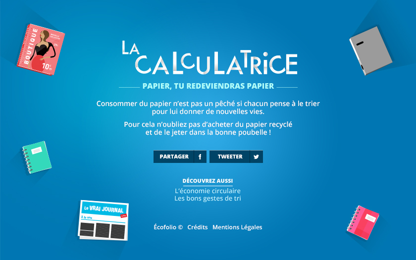
The application would have to allow users to measure their environmental footprint caused by their paper consumption by giving them striking equivalencies.
The final format was going to be an easily-embeddable web application that would also work as a standalone Facebook app.
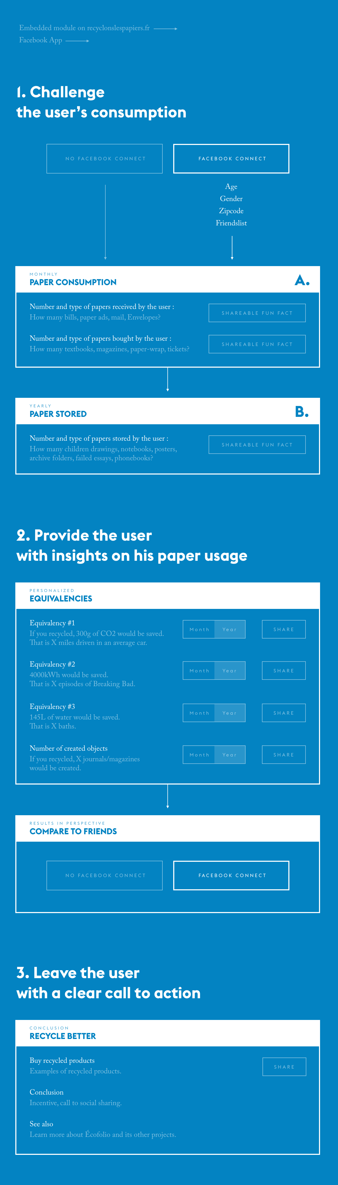
UX Recommendations
We provided Écofolio with several UX Design recommendations, trying to answer their different questions in the best way we could. This allowed us to dress a list of best practices.
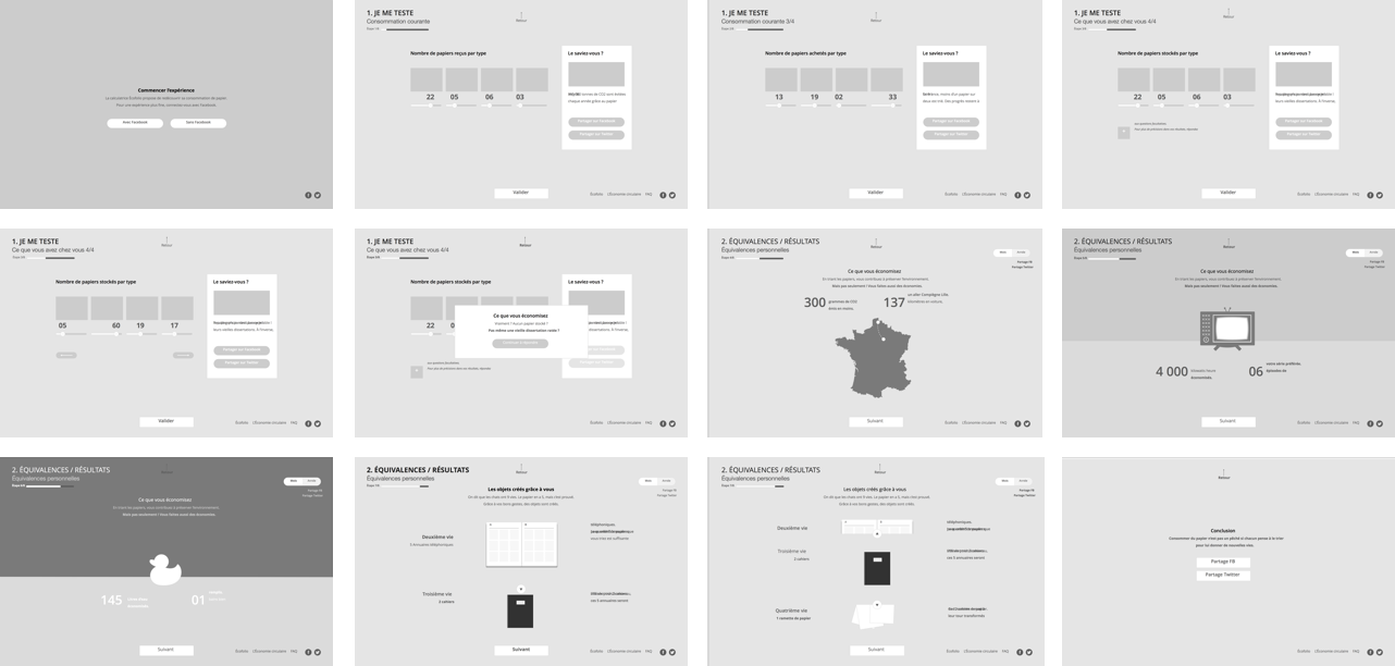
Click Streams & Wireframes
We spent a reasonable amount of time determining Écofolio’s needs thanks to very detailed user journeys and wireframes. This process allowed us to vision the user experience before we started designing interface elements.
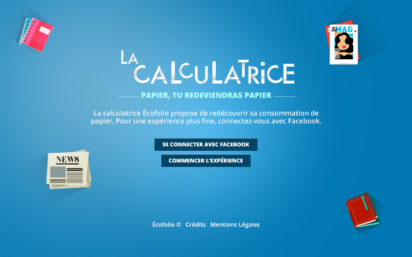
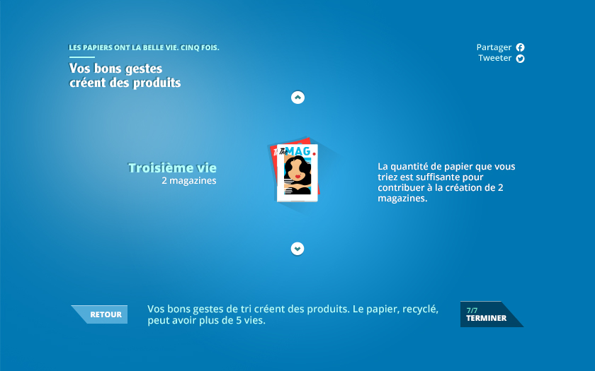
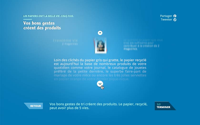
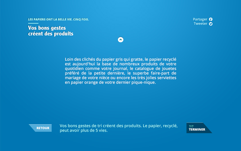
The Interface
A Clearer Goal
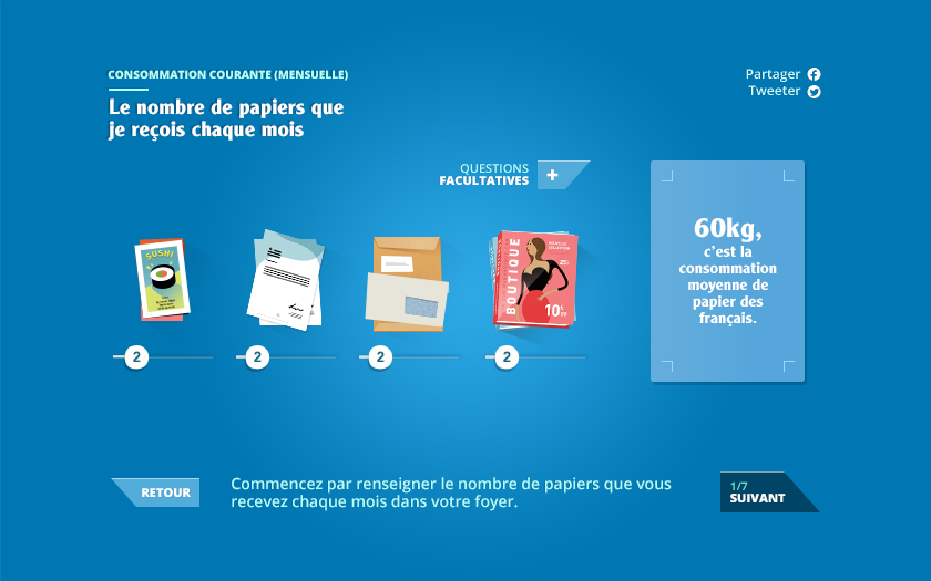
After running a benchmark and asking users directly, we came to realize how most digital experiences about paper that already existed were aging, Flash-based design nightmares.
We asked an illustrator to produce a series of illustrations in order to give a modern look and feel to the subject.
I then worked around these illustrations to create an easy-to-use interface that would be easily embeddable on Ecofolio’s main website and on a Facebook app.
User Interface Flow
I tried as much as I could to cut ties with the UI elements I usually designed. I went ahead and crafted buttons that would both stand out in a cartoon-ish interface and look beautiful next to the illustrations.
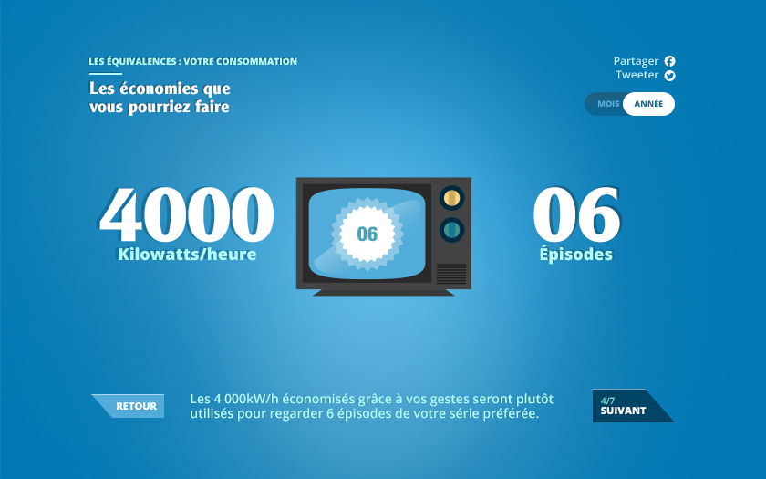
That is 6 episodes of your favorite TV series.
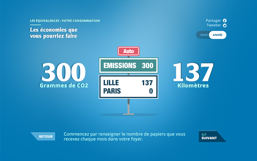
That is 137km driven in an average car.
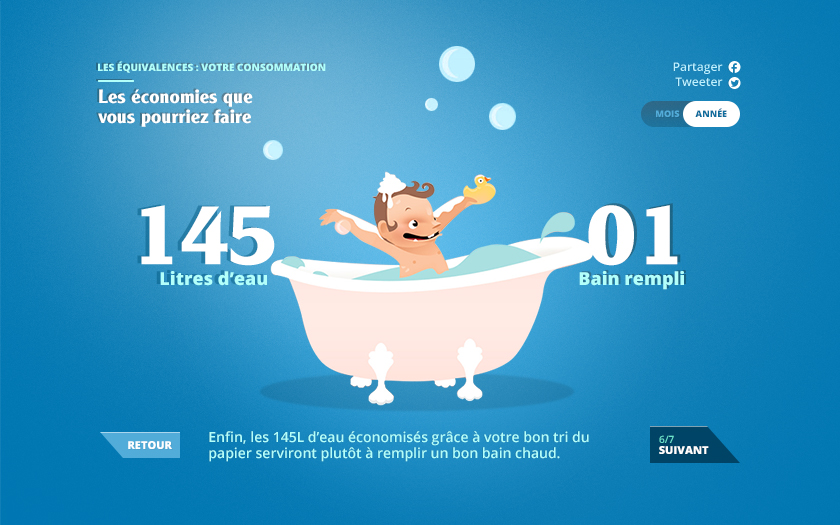
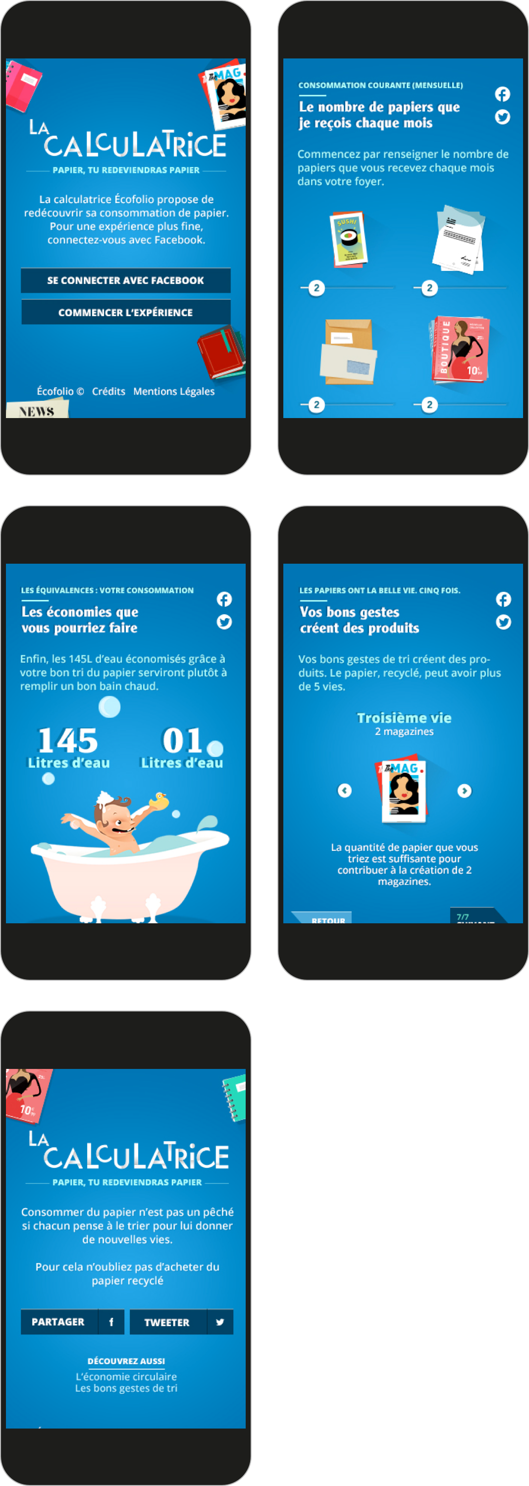
That is one nice warm bath. Bubbles sold separately.
Mobile UI Flow
We adapted the mockups to deliver a mobile version of the User Interface.
Don't hesitate to take a look at the application for yourself. Special care was given to motion design in order to keep to the cartoon-ish aspect of the UI. I hope you'll like it.