Media coverage
through data visualization
-
Project
Mediadata -
Context
Hetic -
Role
Lead Designer -
Year
2014
Insight
Our Insight
The media has an unbelievably significant influence on our way of thinking; yet verifying their impartiality and fair-mindedness is hard.
Recent CSA and IPSOS studies show that 98.3% of French households own a TV set with each individual watching at least 3h50 of programs everyday. Yet 74% of the French think journalists are out of touch with reality and don’t trust the media. We aimed at building a tool that would make veryfing media inputs easier.


French media archives are collected and kept by the National Audiovisual Institute (INA) and data from 1995 to today is available on their database.
We had to decide what main type of data we were going to use: topics, shows or celebrities. We knew of several topics of interest such as the fairly recent and very disputed Taubira Law, and also had in mind how each political party seemed to have its own priviledged TV show. We ended up using celebrities as our main type of data in order to be exhaustive and precise.
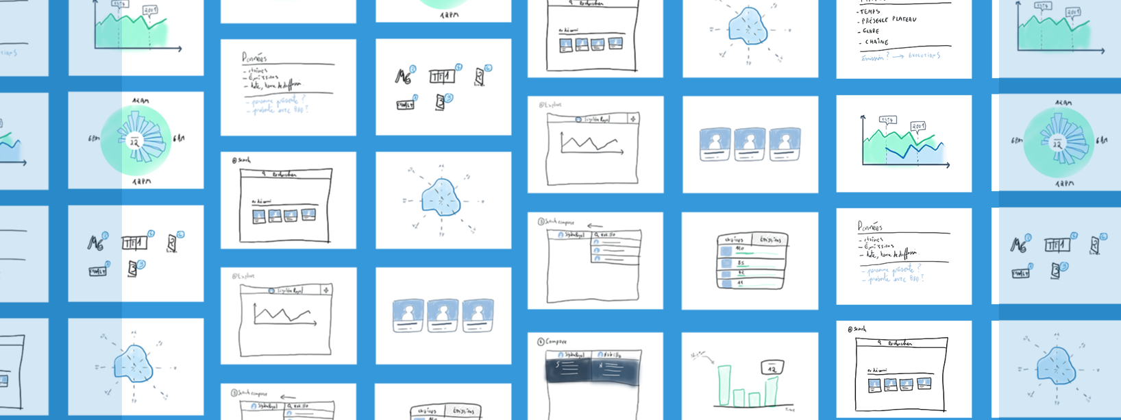
Visualize
Our Insight
One of the main visual design problems we faced was the definition of a color scheme: red vs blue for instance was a reminder of left wing vs right wing.
One of the main visual design problems we faced was the definition of a color scheme: red vs blue for instance was a reminder of left wing vs right wing. We eventually went for a rather neutral color palette using shades of dark greyish blue for backgrounds while an impartial blue and an unbiased green would represent the two compared celebrities.

We decided we would be targetting researchers and journalists and went for a product that would look more like a feature-oriented tool rather than an artsy experiment.
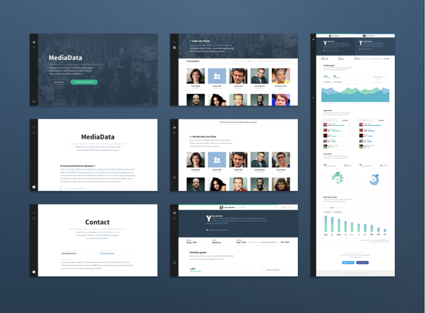
UI Choices
It was very important for us to keep a certain consistency between the different screens and modules since we weren’t going to curate the final content and numbers ourselves. Most of that consistency came from simplicity in the UI.
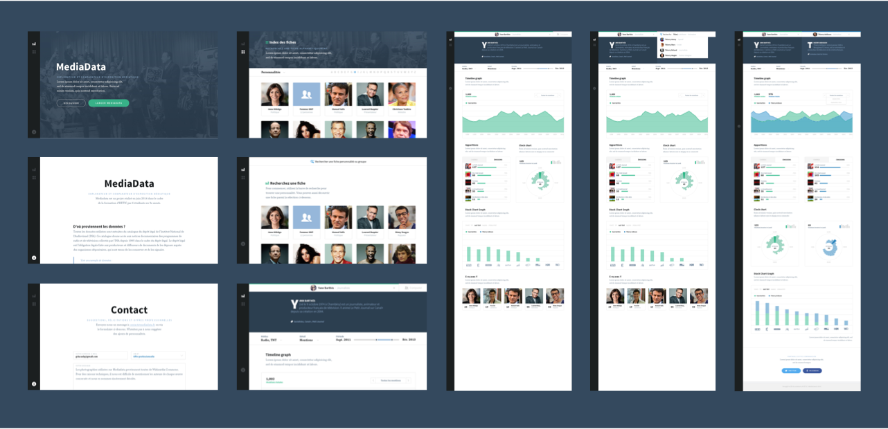
Mediadata was not designed for us power users only, and as a general rule we wanted to make interacting with the tool pie easy.
The data sheets can be found with the searchbar, or by using the Index, which remains visible in the left sidebar navigation through the whole experience.
We worked around the navigation concept of browser tabs, known to anyone who has ever worked on a computer, in order to make browsing celebrities' data sheets easier.
-
I
Use the searchbar to find a celebrity’s data sheet.
-
II
Take a look at the celebrity’s appearances and mentions.
-
III
Open a new searchtab to compare the sheet to a second one.
-
IV
Compare the two celebrities' presence in the media.
Designing for
Edge Cases
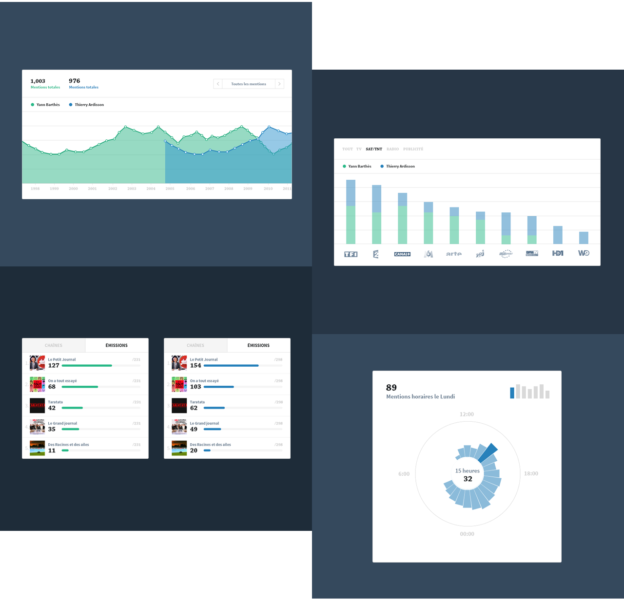
We were extremely careful not to fall for one of designers’ usual mistakes: designing for ideal, unscaleable lorem ipsum content. The graphs we designed had to be ready for all types and scales of data visualization since the numbers we used were somewhat unpredictable.
Each Mediadata module is able to make sense from any data combination and allow for an easily understandable visualization.

Do give Mediadata a spin if you feel like it and aren’t afraid of the French language.